Grand Circle Travel (In progress) 1
UX Design & Research | Travel Company since 1958
Grand Circle
is a travel company that provides small group trips to travelers who are age 50+. The company wanted to improve their site’s user experience, but didn’t know where to start.
Working with the CTO, and other VP/Director-level executives, I acted as the lead UX designer providing UX research, strategy, prototyping and making sure designs were implemented when working with a UI designer and developers. I mainly used Sketch, Invision, Illustrator, Miro, white boards, post-its and a good, old-fashioned sketchbook.
THE CHALLENGE
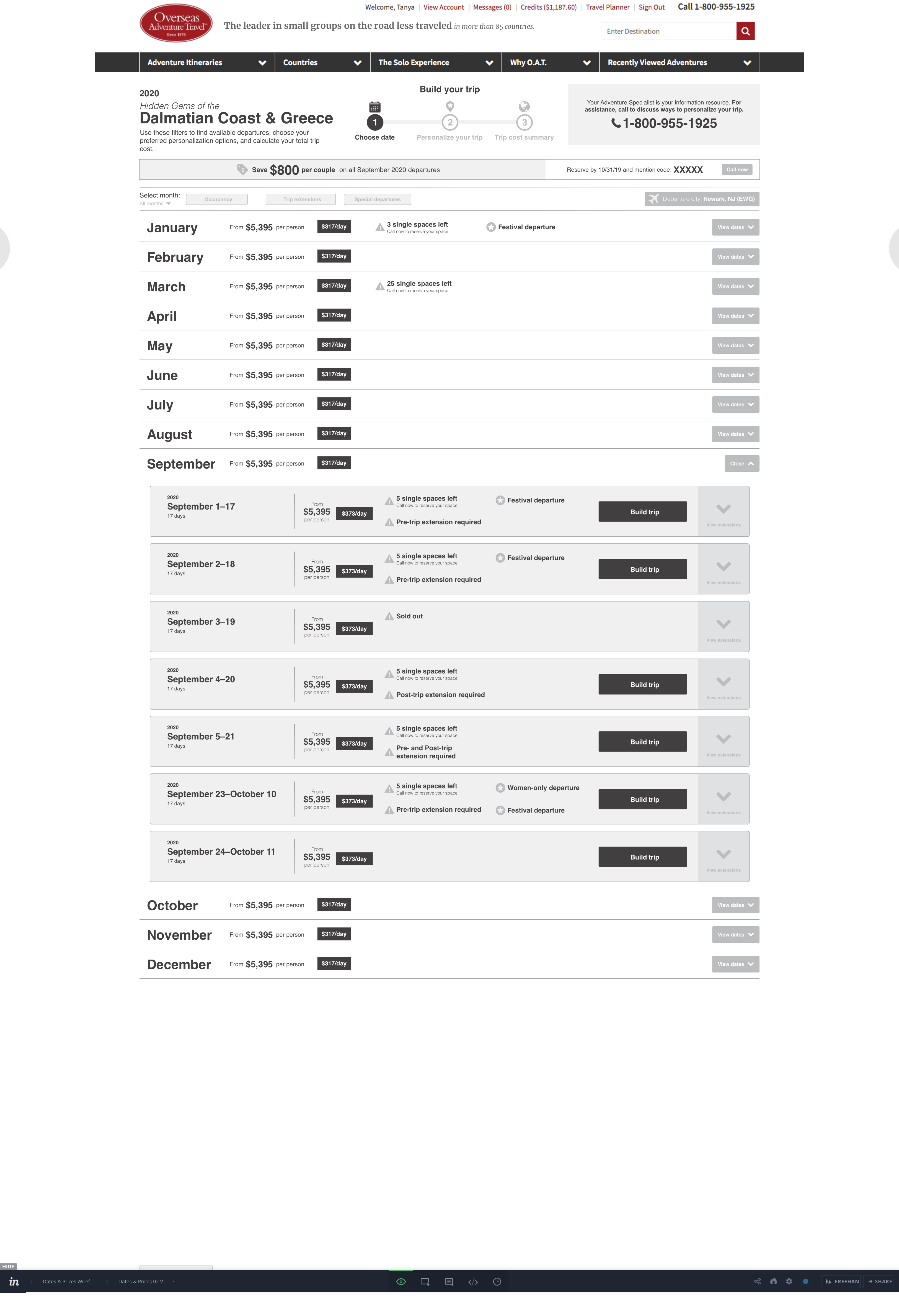
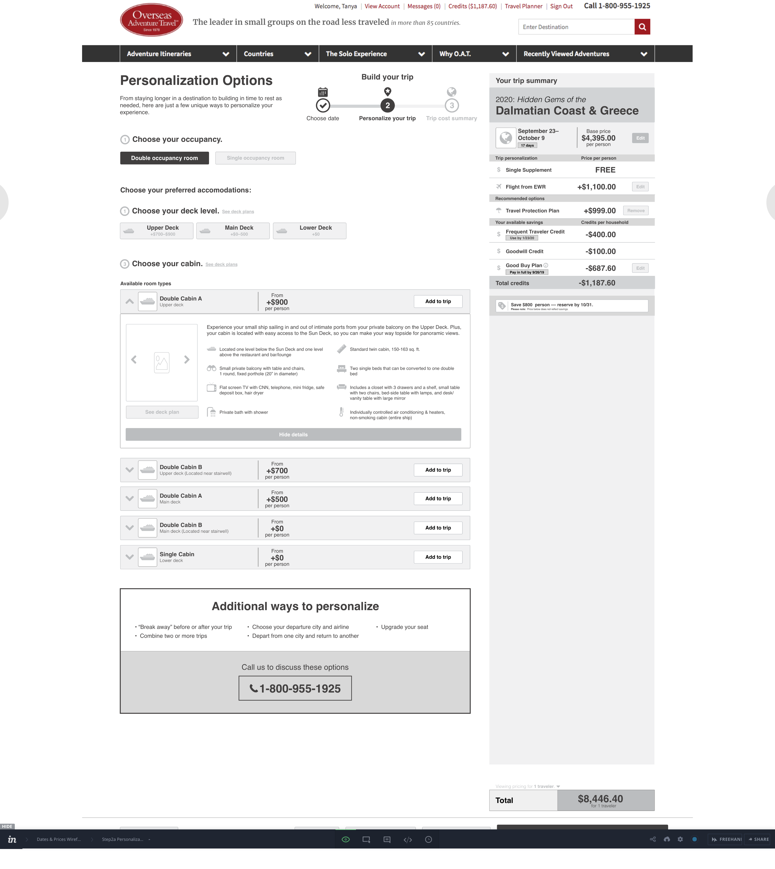
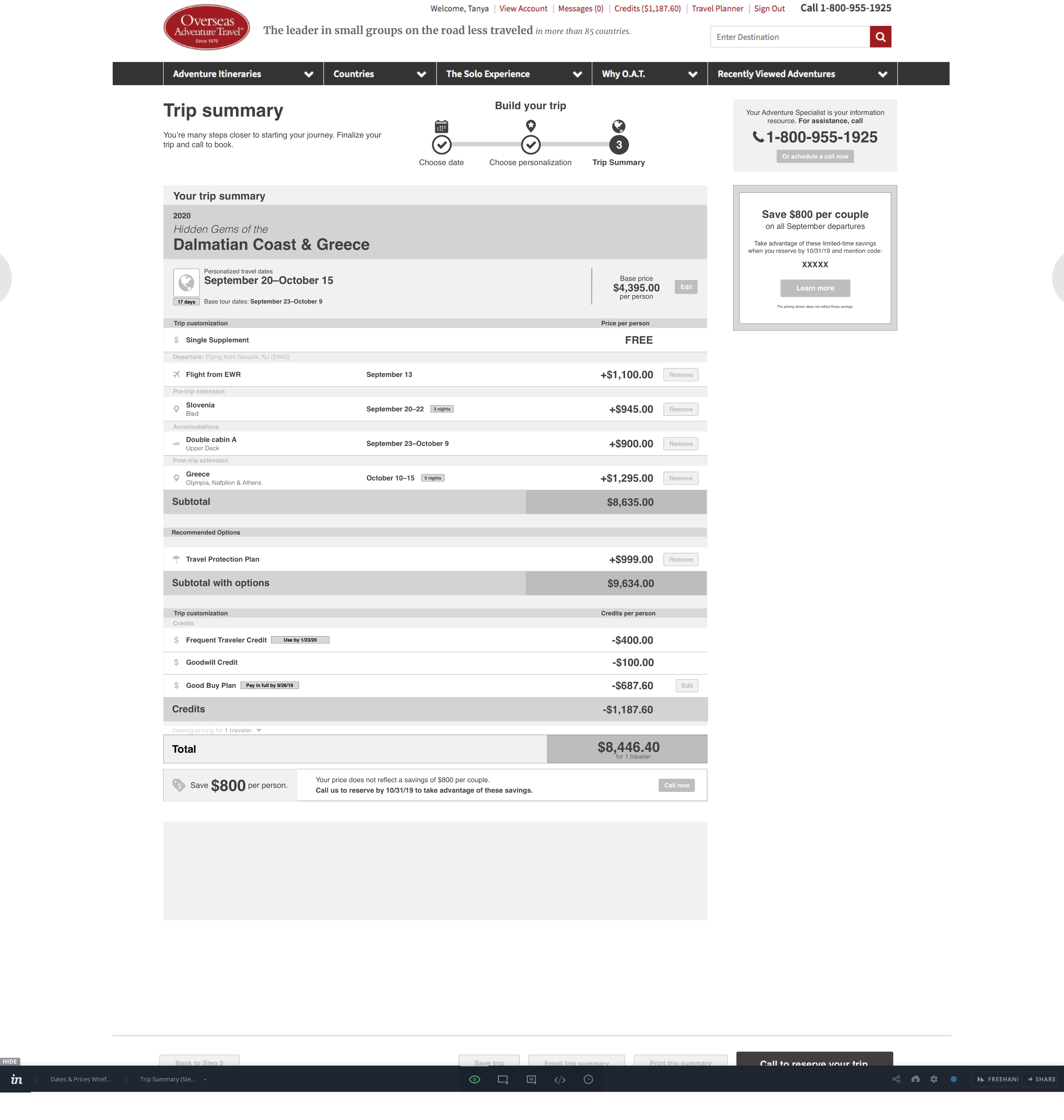
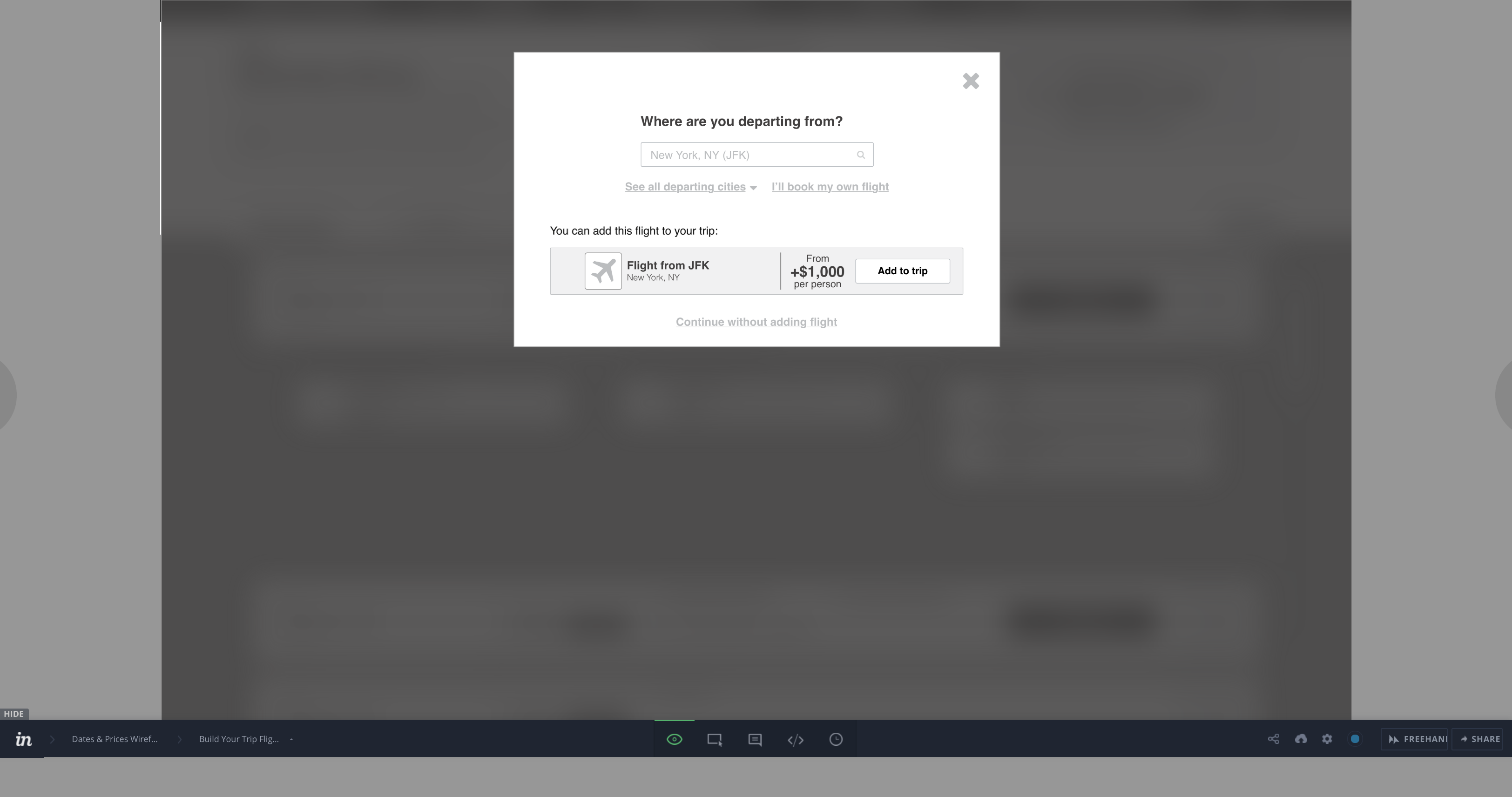
As a business, the executive team at Grand Circle Travel understood that they needed to improve their user experience in order to be more competitive in their niche market, and needed more direction and understanding of how their site was performing and what could be improved. The business decided they wanted me to only focus on the “Dates and Prices” portion of their site since that is most closely related to their sales conversion.
THE APPROACH
Discovery
Stakeholder interviews
I started with stakeholder interviews so I could understand my colleagues roles and the business’s assumptions about their customers. Through this exploration, I determined that the majority of the stakeholders thought that the site was not doing as effective a job as it could be at helping travelers through the “booking a trip” process.
Call Center Phone Jack & Issue Collection
I was able to sit with one of the company’s most skilled customer service representatives to listen in on some calls in order to get more context for how customers search for and book their trips. These insights were valuable in understanding the customer journey as well as looking at the customer service representative’s role as a major player in the customer’s journey. I discovered that because travelers cannot book their trip online through the site, they are dependent on these representatives to tailor every detail of their trips for them.
User interviews at Traveler Event
Next, I attended a “traveler event” where the business gathers some of their most loyal and frequent travelers to provide them with a meal, update them about new trips, and to collect feedback from them about their most recent travels. I learned a lot about many of Overseas Adventure Travel’s products, an affiliate branch of Grand Circle, and was able to directly ask the travelers their thoughts around the website and how they currently use it. Many of these travelers, who were mostly between the ages of 70 and 80 had travelled between 7 and 33 times, generally liked the site. This group was made up of majority single females, next, couples (male and female), followed by parents (70–80 year olds) who travel with their adult children (50–60 years old). Most of these attendees I spoke with liked to use the site mainly to get the best deals on future trips and to research where they’d like to travel to next. This information gave me great insight on what I believe represents one or two personas that use the site currently. In the future, I would like to attend more events like this where there is a broader representation of users in attendance in order to understand who else is using the site.
Analytics
With the help of the analytics team, we got some initial benchmarking data about drop-off rates in the last 90 days within the starting “Dates & Prices” userflow. They concluded on the “Land” products in the “Dates & Prices” area of the site, that only 20% of total visits completed the entire cycle (29K users who visited dropped to a little less than 10K), and for the “Ships” products, it was even less at a 13% drop-off rate (About 21K dropped to around 3K). Also, there was no way to track actual sales conversions since users could only book their trip over the phone. Additionally, 40–49% of total site visits ended on the very first Dates & Prices page of the user flow.
Using the online analytics tool, FullStory, I found some interesting insights on the initial website. The biggest observation was that the site’s overall “Rage Grade” was a “C-” meaning frustration levels are in the lowest 25% of the industry. Also, about 52% of users were on desktops, but 32% were on mobile devices followed by 15% on tablets. Within the Dates & Prices area the most “View available dates” CTA button, one of the most prominent buttons on the second page of the flow had 86% of all the rage clicks. This may be because page load time is extremely slow and there is little indication of feedback once the user clicks.
I’ll be curious to see the comparative analytics for the new design, but that is TBD and the live date is set for late February 2020.
Synthesis
Heuristic Evaluation
Using Nielsen-Norman Group’s 10 usability heuristics I pinpointed areas of potential usability issues within the Dates & Prices user flow. I found several major and minor usability issues with the website including accessibility issues such as no alt tags on images, which can be used for the visually impaired users. I used these issues to prioritize what features to build in the MVP (Minimum Viable Product) that would have the greatest impact.
Customer Journey Map
To help explain the user flow to stakeholders from a user-centric perspective, based on Stakeholder interviews and other minimal research, I outlined what I hypothesized to be the customer’s journey. This journey map aided me in explaining the user flow to stakeholders in order to sculpt a UX strategy that would better align the business with customer’s needs. I hypothesized that during the dates and prices portion of the site, the users were either in their “detailed research” phase or in their “decision-making” phase. With this perspective, I could help influence stakeholders to include tools and a user flow that better matched their user’s potential journey.
User flow map and Comparative analysis
In order to better understand the site’s user flow, I created a user flow map for the Dates and Prices section of the Overseas Adventure Travel site and analyzed the user flow noting where I observed potential usability issues. I found there were several confusing user flow loops and no direct pathway that lead to purchasing a trip among other issues. I then did this same user flow map breakdown for the similar areas of two major competitors, Road Scholar and National Geographic Expedition. I found that these sites funneled their users so that whatever choice was made, it led them closer to purchasing the product, although Road Scholar created a paywall that forces users to sign in to build their trip, which I hypothesis may prevent more users from completing the task.
Affinity Mapping
From the traveler event interviews, I gathered my notes and put all the observations onto sticky notes to see if I could start to see patterns or trends about these travelers and form a basis with which to create website personas. I found some common user touch points and pain points, and that the main web users of the event attendees were either single women or partnered women who were the decision-makers in their household. They were usually between the ages of 70 and 80. These women value unique, new and people-centric experiences, are concerned about the environment, and like finding a good deal. They generally use the website several times a week in order to catch the best deals or do research for potential and upcoming trips. They generally trust information from other travelers, but not necessarily the information given by the website, so they tend to trust customer reviews to understand things like local weather in the places they are traveling more than the trip information shown on the site by the company. The biggest trends for why these travelers use the site were to get deals on future trips and to check on details about their upcoming trips.
This synthesis led me to formulate this question:
How might we improve upon the user’s customer journey, specifically within the “detailed research” and “decision-making” phases to lead them to book a trip?
My Solution
High Fidelity Wireframe Prototype
Because of the business need for a presentable deliverable that they could get approval from key stakeholders, such as the CEO, I was required to create a high-fidelity, clickable prototype. I decided to keep the branding elements out of the wireframe since I had noticed a pattern for the business to pay more attention to the branding details than to overall functionality and usability. I wanted the wireframe to help the business determine the priorities of the features, functionality and user flow that both made sense to them and would improve the user experience. Once approved, we started to incorporate the UI and branded elements before passing the prototype off to the development team. I am working with another UI designer and the development team in India to implement the wireframe.
Challenges
This management team has historically used a waterfall approach that didn’t usually incorporate UX and visual design in developing the site. The development team, however, uses an agile approach in dividing features to be developed. This differing methodology initially caused some friction, especially when it came to understanding where in the process design would fit in. This also made it difficult to gain initial support for spending time or budget to gather UX research with which to base the designs from. Since one of the team’s main values was to work fast, I helped guide the team to build an MVP (minimum viable product) so they could quickly roll out a new design to later iterate on when there will be more time to do more detailed research, such as usability testing. Also, helping the team to incorporate the mindset of looking at things more from the user’s perspective proved rewarding, especially leading up to getting design approval from upper management.
Results
This project is currently still in progress, but I have no doubt that we will see an increase in task completion that will translate into a higher sales rate from online users. This is TBD and we should have result after this goes live in February 2020.
